Case study
Targeting Hyper-Polluting Power Plants
RASEI, CU Boulder (NSF-funded) · 2019–2021 · Climate lead
A global analysis of whether climate and energy policies actually change emissions from the world's electricity sector — and where targeted policy would do the most good.
Context
The problem
Electricity generation is one of the largest sources of global CO2 emissions, but the question this NSF-funded project set out to answer — do climate and energy policies measurably affect emissions at the plant level, worldwide? — could not be answered from any single existing dataset. Facility records were scattered across many databases with inconsistent identifiers, missing coordinates, and gaps in the emissions and generation figures. Policy data lived in entirely separate sources, disconnected from the plants those policies govern. Before any causal question could be asked, someone had to build the global plant-level picture. I led that climate-data side of the work.
Approach
The method
Four steps, each traceable:
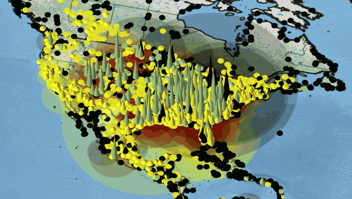
- Integrate. I combined 16 distinct power-plant and policy databases through a custom ETL pipeline, reconciling inconsistent facility identifiers across sources.
- Geocode. I filled in missing facility locations across more than 30,000 plants, so every plant could be placed on the map.
- Gap-fill. For the data gaps that remained after integration, I trained gradient-boosting models to estimate the missing values, reaching 99.9% accuracy. Model-filled values are estimates, not measurements — the distinction matters for anyone reusing the data.
- Join. Spatial joins mapped each plant to the climate and energy policies governing its location, connecting the facility layer to the policy layer for the first time in this dataset.
Finding
The result
The headline finding: a relatively small set of hyper-polluting plants drives a disproportionate share of global electricity-sector emissions. That asymmetry has a practical implication — geographically targeted policy aimed at the worst plants could yield outsized climate benefits, faster than economy-wide instruments alone. The analysis was published in Environmental Research Letters (Grant, Zelinka & Mitova, 2021).
Want to see what “every number carries its source” means in practice? This finding, unfolded layer by layer — the claim verbatim, the data under it, the estimates it leans on, and where it's soft.
Explore the shape
A concentration curve
Rank every plant from worst emitter to best, then walk along the x-axis. The curve shows the cumulative share of emissions you have covered. Drag the marker — or focus the slider and use the arrow keys — to move the threshold.
The top 5% of plants account for about 73% of electricity-sector emissions.
Illustrative — the shape of the published finding (Grant, Zelinka & Mitova 2021), not the paper's raw distribution. The curve is anchored to one published point: at the worst ~5% of plants it reaches ~73% of emissions. The rest of its shape is a smooth stand-in drawn to pass through that point, not the paper's underlying data. It is here to make the asymmetry legible, not to be re-measured from.
Traceability
Provenance
What traces to what:
- Data. 16 source databases of power-plant and policy records, integrated via custom ETL. Geocoded locations and gap-filled values are derived — produced by the geocoding step and the gradient-boosting models respectively — and should be read as estimates layered on top of the source records.
- Code. The ETL, geocoding, and gap-fill pipeline was built for the research team at RASEI.
- Publication. Grant, Zelinka & Mitova (2021), Environmental Research Letters — the peer-reviewed record of the method and findings. My publication list is on ResearchGate.